We are looking for a framework diagram for Open Source Circular Economy. How to express the OSCE-idea visually?
Background: In a strategy-call on September 8 2017 of the OSCEdays BoST @sharmarval came up with the question/idea to have a framework diagram to visually explain what OSCEdays is about. Because we don’t think that the existing diagrams do the job.
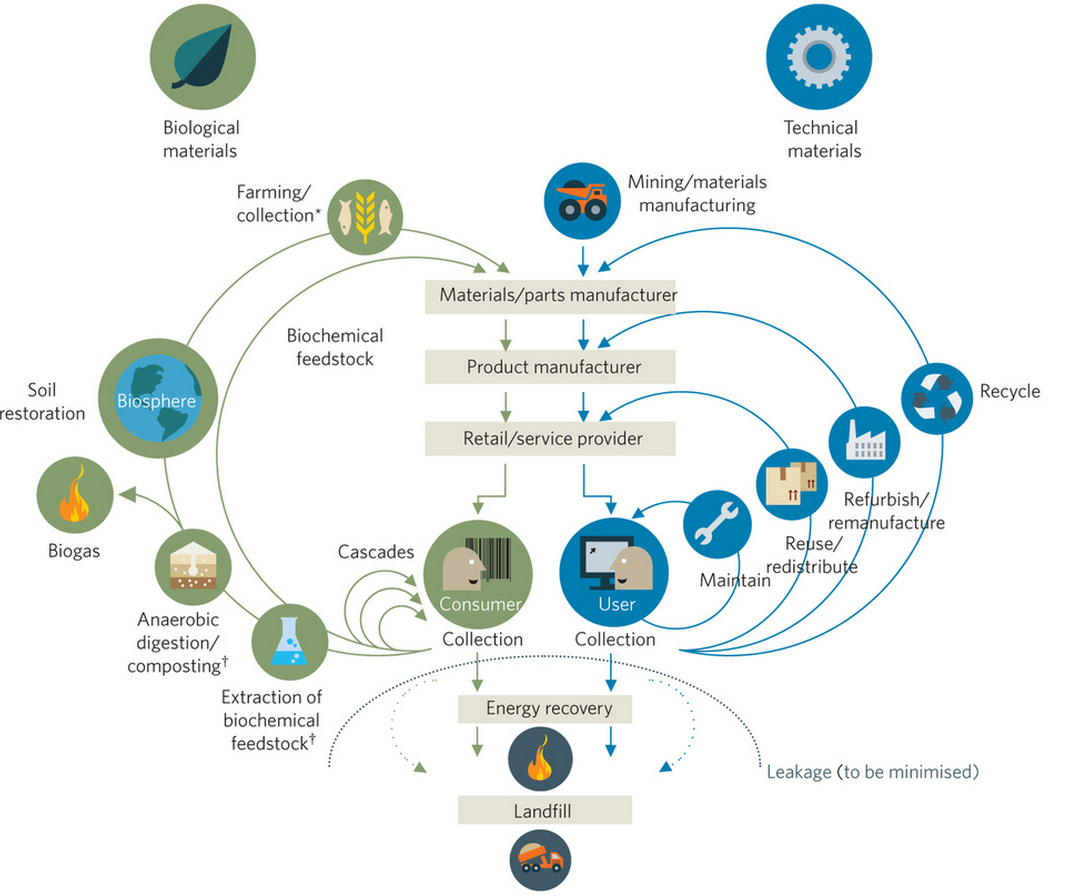
##‘The butterfly diagram does not reflect what OSCEdays is for.’
@sharmarval shared as first inspiration this famous image:
And indeed! This is very interesting. I have it on my OSCEdays slides for a while now and also @cameralibre used it when presenting OSCEdays at the EXPO2017 in Astana.
I have shared this GIF several times. I really like it (although it is not OS). It reflects complexity somehow. And it is all circles!
But a GIF animation is not good for the the job of explaining OSCE because in a GIF the cycles will always be the same. And OSCEdays is about accepting that the cycles will be different all the time and therefore the information how to close them needs to be everywhere – needs to be Open Source.
Maybe a programmed illustration that changes and iterates all the time would be good. But you can’t print animations into a book.
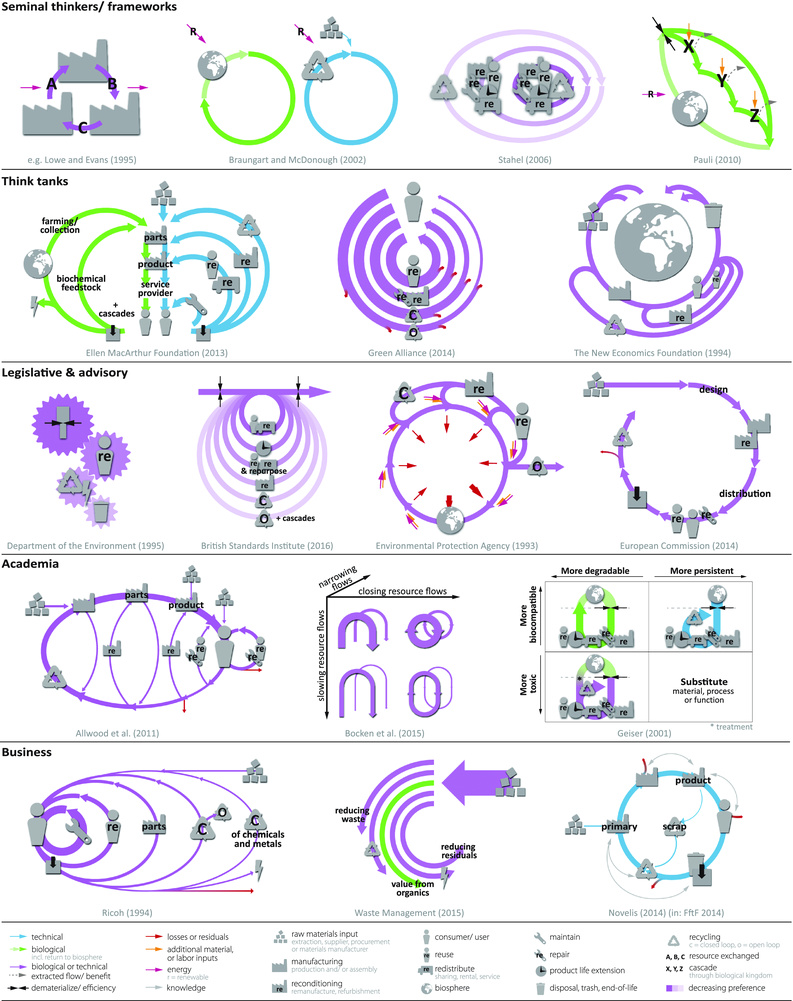
and I’ve just made jpg versions of everything and uplpoaded on this reply to make it easier. In all cases, the reason for these diagrams is to explore and display the distinctions between an open source circular economy (OSCE) and a closed source circular economy (CSCE). In particular, we are interested in exploring the less explored side of the circular economy, the ECONOMY side, and to unpack the different types of value flows possible in a CE. The specifc way we achieve a circular flow of stocks can determine the economic and social wellbeing of a society, so it’s a really relevant question to explore.
We make some common sense assumptions here which may not be valid so we invite everyone to comment and offer feedback. This analysis doesn’t imply we are in favor of replacing all CSCE and all at once, as that in itself would be both unrealistic and could easily result in stranded assets. Common sense tells us, however, that our future will be more just if Open Source, Decentralized, Local Circular Economies make up a significant portion of the types of future CEs. What will be the centralized/decentralized or open source/closed source distribution look like? What is achievable? What it optimal? These are all open questions. In educating people on the distinctions, it could help organizations to make an informed decision about how best to achieve holistic wellbeing by meeting the triple bottom line of planet, people and economy.
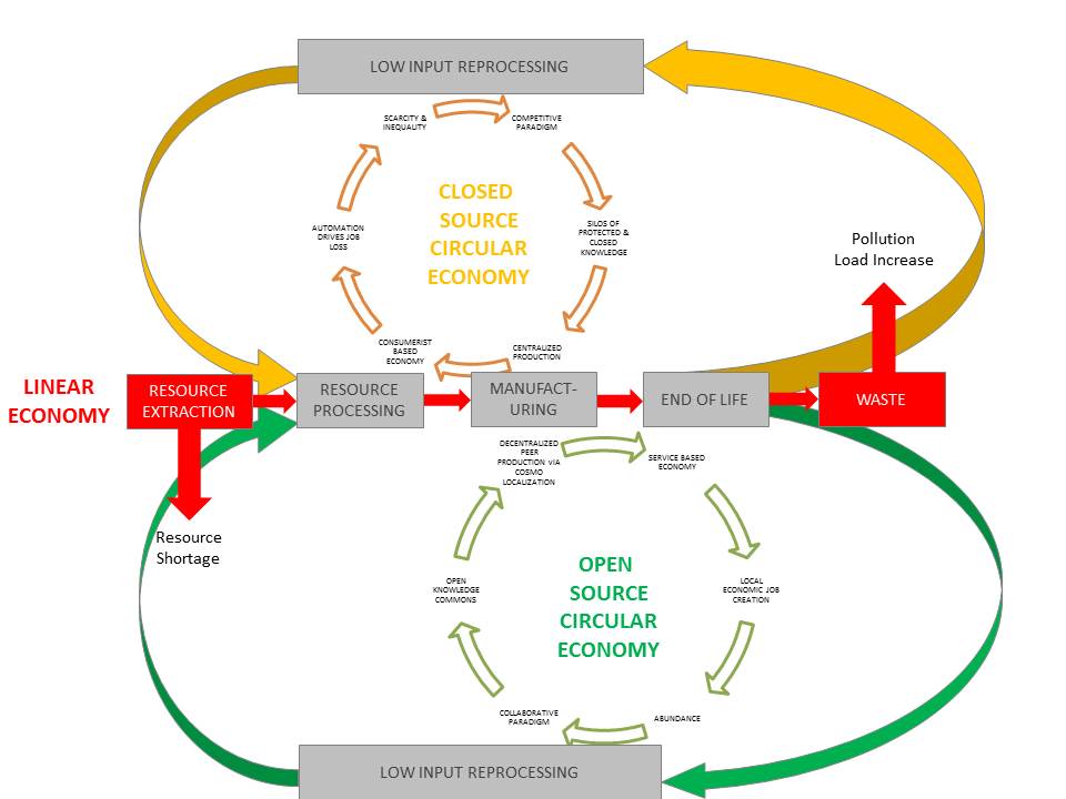
###First drawing Open Source CE vs Closed Source CE
The usual linear take-make-waste economy flow is shown in the middle horizontal part of the diagram. It starts with Resource Extraction on the left-hand-side and ends with Waste on the right-hand-side(ie. Landfill, ocean, CO2 emissions, etc)
The two ends of this linear chain are shown in red with arrows to indicate that they are the two end products of a linear economy:resource shortages and increases in waste load.
The yellow oval loop on the top part of the diagram shows what happens in a Close Source Circular Economy. The iner flow circle starting at MANUFACTURING block shows: centraliized production leading to a sales in a consumerist-based economy (where profit depends on creating novel goods and services, and hence supporting a throwaway culture. In such a circular economy, it may not be throwaway but it is supporting short product cycle times, which still consumes a lot of energy and resources. Automation and job loss are supported by centralized production as each producer competes to reduce costs. This leads to lower employment, more scarcity and greater inequality which supports competition and encourages protection of idea, patents and close source. Only those producers with access to capital can produce.
The yellow loop is a circularized economy that maintains the current status quo economic centralization, inequality and closed source knowledge approach. It may resolve ecological problems but not social and economic ones.
The Green loop is the open source circular economy. The inner circular loop shows decentralized, peer production and results in a service based economy with an emphasis on building things that last and providing work through maintenance and repair and supports local economies. This creates abundance as many more people have a chance to derive a livelihood as a producer, and this encourages collaboration and especially sharing of ideas, which encourages more peer production.
The main point of the diagram? …as we are transitioning the physical flows to circular ones, why not transition the value flows at the same time? This way, we will achieve a holistic society of wellbeing.
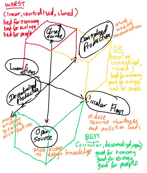
This diagram uses 3 different variables on x, y, z axis - linear vs circular flows on x, centralized vs decentralized production on y and open source vs closed source on the z axis. It shows that:
(linear, centralized, closed) - red sector is the worst
(circular, centralized, closed) - yellow sector is better but not the best - addresses physical and biophysical but not social and ecological juistice
(circular, decentralized, open) - green sector is the best because it addresses the entire triple bottom line of business, people and planet
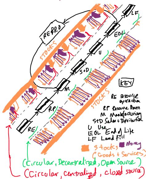
Third DIagram - Stock vs Value flows of Open Source vs Closed Source
This diagram uses the blocks of the linear flow on a diagonal line. The circular flow is created by “closing the loop” between Manufacturing and End of Life of the product"
There are two types of Circular Economies shown:
Above the diagonal line is the (Circular, centralized, closed source) type of circular economy
Below the diagonal line is the (Circular, decentralized, open source) type of circular economy
The GDP of each worker employed in each sector (RE- resource extraction, RP - resource processing, M - manufacturing, etc…) is shown. The green lines in decentralized scenario indicates a more even distribution of GDP while the red line in the centralized scenario indicates inequality.
The orange arrows indicate stock flows while purple arrows indicate monetary flow. Note in the centralized CE, there is a small population that has significantly more GDP and hence higher stock flow.
HI! very cool idea. and very challenging i think. Ho to visualize Open source…
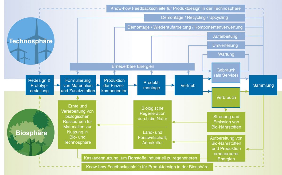
I would love to participate. For the moment i just have two “inspiration” and one thing about the butterfly diagram you posted before. It is an old version which is not right! the ellen Mac Arthur Foundation did the mistake to speak about biological and technical material. This is not what is abut. Its about the right materiel in the right usage scenario which is in the biosphere or technosphere. They use another version now on the website.
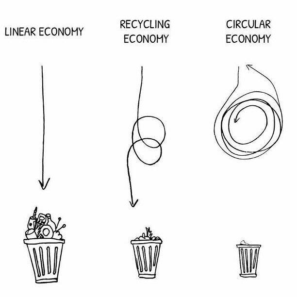
here are two other “system” approaches. The first is from the story of stuff. so simple and i love it. but how to geht open source into it?
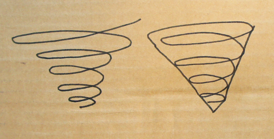
I wrote a longer comment in the related definition discussions that is also mirrored on my blog in better layout. The post plays with “spiral economy” and similar ideas. I made a bunch of illustrations for it. Maybe some of them are useful here.
####somehow a spiral that branches out to other spirals that branch out to other spirals … ? Two right next to each other: the biological and the technical spiral.
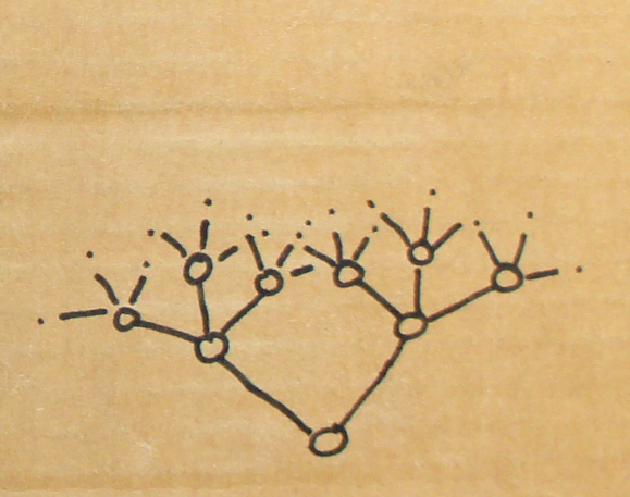
I was looking at the butterfly diagram again. Isn’t the big problem just that it talks about a manufacturer and provider instead of manufacturer_s and provider_s? @sharmarval
@Lars2i totally agree with you. I really think that this is an important observation. So in one diagram, there would be multiple manufacturers and multiple users and the exchanges between them could be multiple…
I get the spiral concept, but I would prefer to avoid the word, because I think it has certain connotations. I really like the direction of the third diagram. In this, the large nodes could represent multiple manufacturers and the smaller dots multiple customers. There would be multiple ‘reverse flows’ between different customers (e.g. sharing/hacking) and multiple reverse flows back to various different producers. Maybe there is also this blurring between producer / consumer that we need to include more … will work on it more later.
The images I shared above aren’t good or meant as ideas for a new draft. More like things we already thought about and that aren’t doing the job.
Right now I think the best way to find a new diagram ist to start at the butterfly diagram and iterate that (because it is not everything wrong with it). If you put everything into plural I think the main problem is already solved! And then try to add something that highlights that information needs to be shared along lines too… And you are close to perfect.
Ah, just remembered a graphic I made many years ago (also not saying it is doing the job). But it has lines for “sharing knowledge” in it.
free knowledge enables circularity and free circularity enables to build more free knowledge to enable circularity.
Great, I think you’ve set two key conditions that we want to be able to communicate: multiple interactions, and information. And, yes I agree it might make sense to start with the EMF diagram.
In the EMF model of the CE there would also be information, so we still need to come up with an idea about how to convey that this is open.
Re your comment: “I mean the whole left part of the diagram I never really got. But in general: If you run through the butterfly diagram” on Facebook.
I think this is also a really good observation and something that I knew in the back of my mind. To some extent the EMF is dealing with material flows on the left and product flows on the right, which isn’t very consistent.
So, a question we should think about is, do we want to think about material flows or product flows? I think it’s the latter. In which case, food (i.e. a biological nutrient) would often be transported in a package (i.e. a product / technical nutrient) making me ask if it is logical to separate these two systems?
P.S. I love this sentence: “free knowledge enables circularity and free circularity enables to build more free knowledge to enable circularity.”
One idea to convey that it is about information could just be to a little sentence in the diagram saying that this arrow is for atoms and bits at the same time. In combination with a large headline like “Free, Circular Flow of Information and Atoms” or something like that could do the job. No extra arrows. The butterfly diagram is already quite complicated. Should not become more complicated.
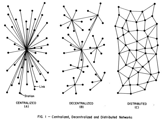
In my mind I imagined a diagram that uses the distributed production one as a basis and maps icons for users / suppliers / producers onto it to illustrated multiple transactions in a non-centralised way…Today I saw a paper from South America that develops this exact same idea. You can read it here.
At some point we should settle for one, even if we will change it later. There is the risk of spending too much effort on symbolism and finding the most impressive visuals (like the play Kate is doing) and not enough on making the model happen.
I do like the distributed network concept and visual as being the closest to OSCE. I see a few criteria to be included in final diagram we will settle upon:
Economy is nested in society which is nested in nature. In other words, economy should be shown in its proper place withing the planetary life supporting cycles.
Humans and all other living things are at the core of OSCE model, not materials, not products, not money. It’s funny how there are humans are only users or consumers surrounded by all kind of stuff in the EMF diagram.
Localization and globalization or cosmo-localization are equally critical to OSCE, so we have to reflect clearly both global open knowledge sharing and local design/making/consumption. I view knowledge as the most important flow in our concept of OSCE.
If Gien or others can take the distributed network and adapt it to reflect these criteria and the definition we will adopt, I think that would be great.
I am not good at artistic visuals, but for reference here what I use for CE.
I tend to think more and more that resource efficiency and circularity comes as a result of a different economy centered on inclusive human development. Currently the discussion of CE is about how do we make the economy circular, pointing mostly to the surface and the resultant behavior of today’s economy.
In my view if the economy is centered on human development (in its broadest term), it demands of regenerative infrastructure (the way we solve agriculture, mobility, housing, healthcare), as well as full employment of human-natural resources (including the circular loops).
Why the economy takes, makes and disposes (not only products, but mostly people, entire regions, communities and nature)? What drives this metabolic spiral?
What type of economy would do the opposite? What type of economy would employ the worlds human capacity in its full potential and would develop the necessary things(products, infrastructure) to make it possible?
How this translates into an agenda of partial, but aligned, economic interventions that articulate in this new context? What is currently happening today that is representative of these interventions (Open Source is clearly one of the big things, but there are more stuff)? What movements, technical development, financial opportunities etc, can we identify?
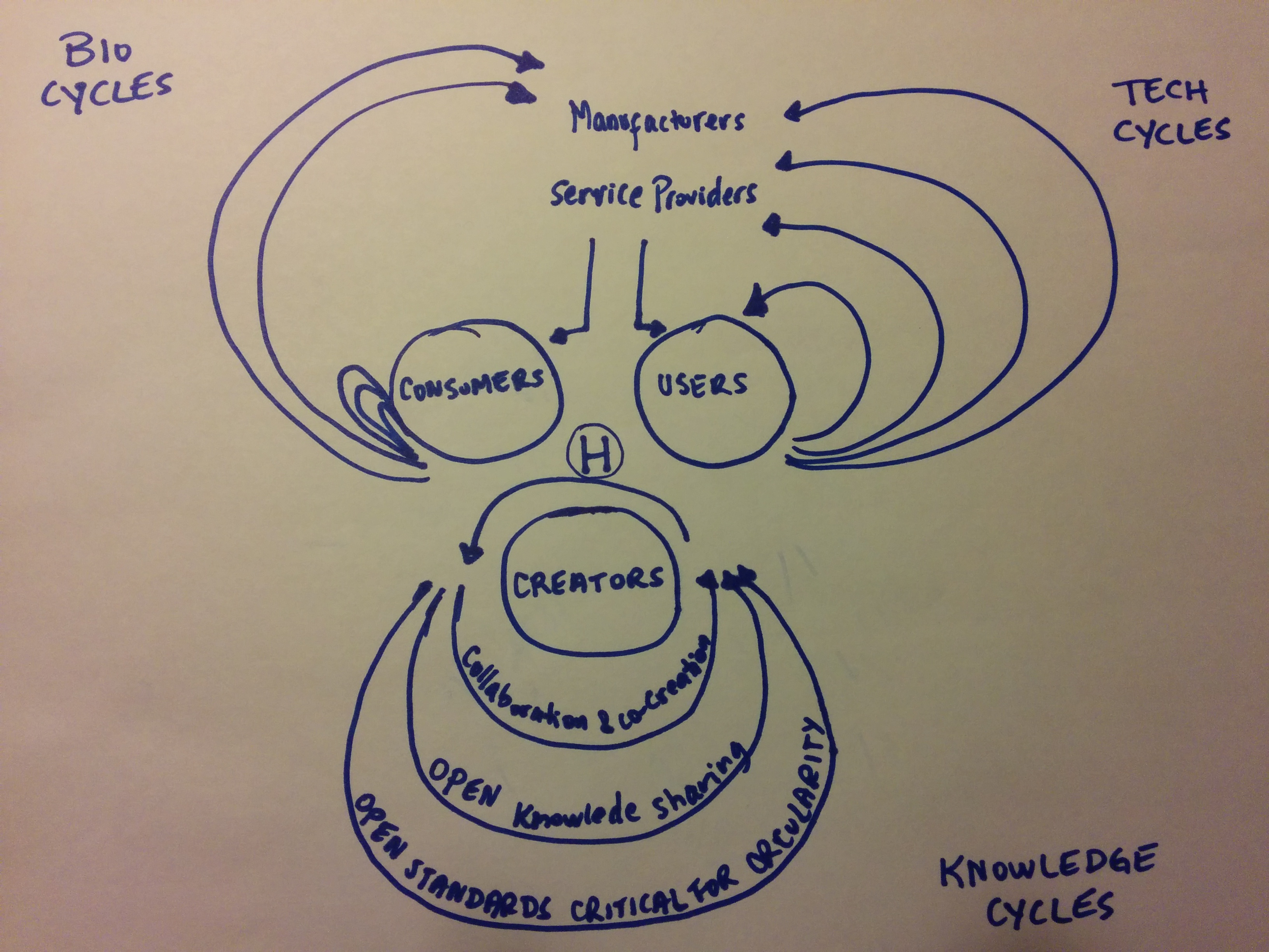
Although the EMF diagram may not be complete, it’s been quite useful to communicate the basics of circular flows to people that are just starting out. Therefore, I would support keeping it as a base, with the suggested Plurals (e.g. manufacturerS) and adding a third resource flow for knowledge.
Here’s my attempt at incorporating this third cycle (apologies for my limited drawing skills).
The H in the center is for HUMAN as a reminder that we are more than users, consumers and creators, and the human capital is the most critical resource to make the rest of these flows a reality.
And below (in case my writing is not legible) it says:
First loop: collaboration & co-creation (this would be the highest level of sharing that we would strive for)
Second loop: open knowledge sharing (this would involve the sharing of data and skills, but not necessarily working in collaborative way with one another
Third loop: open standards critical for circularity (this would involve only sharing what is absolutely essential to enable circularity to happen in certain systems)
What I think is missing here is the currency/money flow. It may not be essential to convey the OSCE concept, but I do think that how we use currency (in broad terms) to enable all these interactions is also important to have a holistic picture of a circular economy.
I’m playing with these ideas, so of course I’d appreciate your feedback on this


