###Update
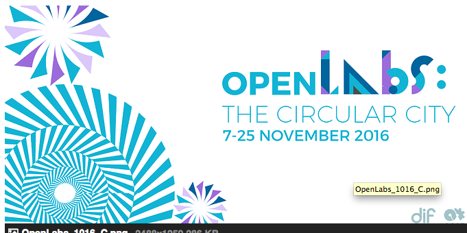
The final SVGs and PNGs can now be found under OpenLabs in the Design Files folder.
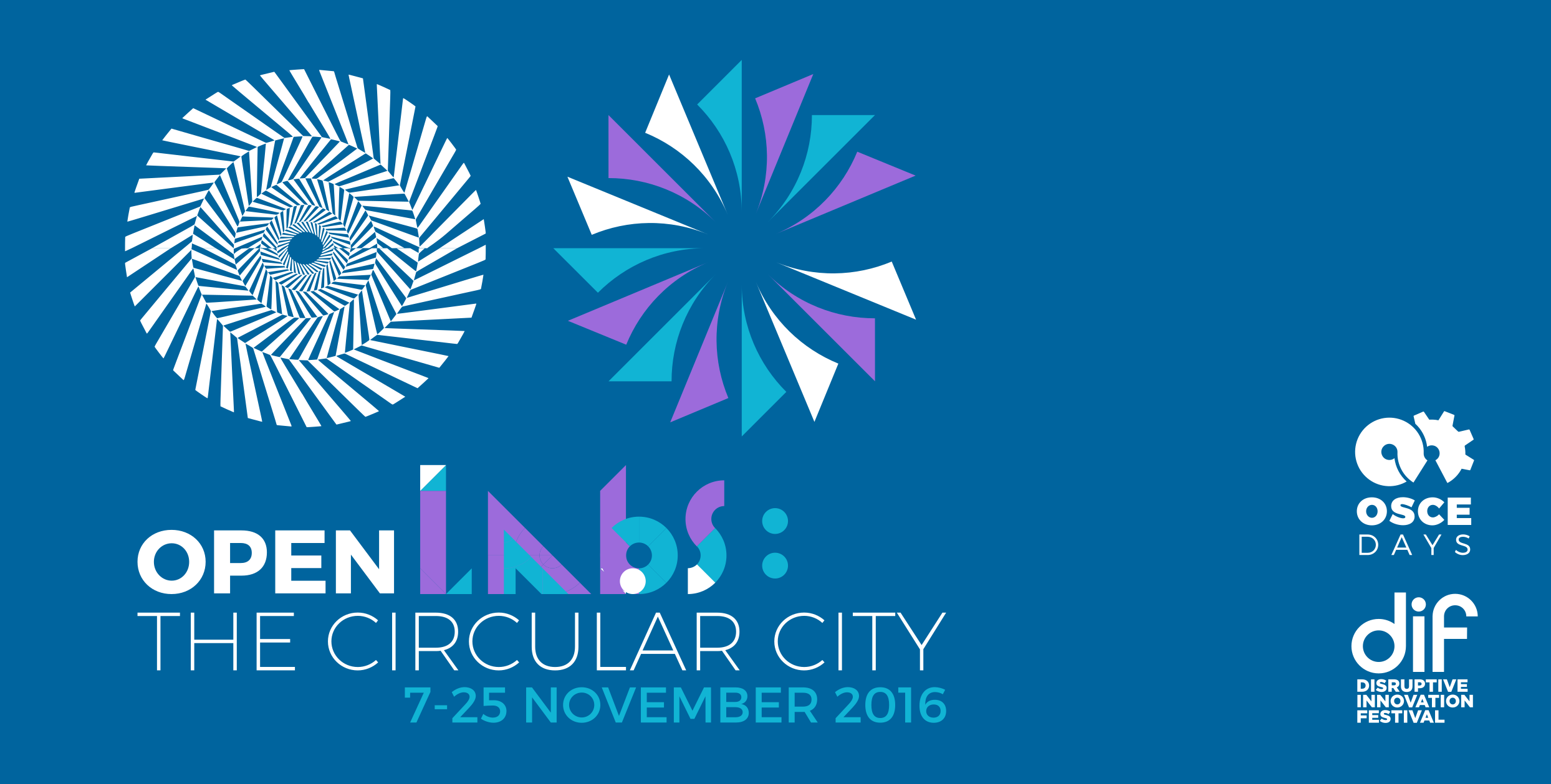
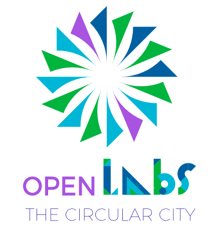
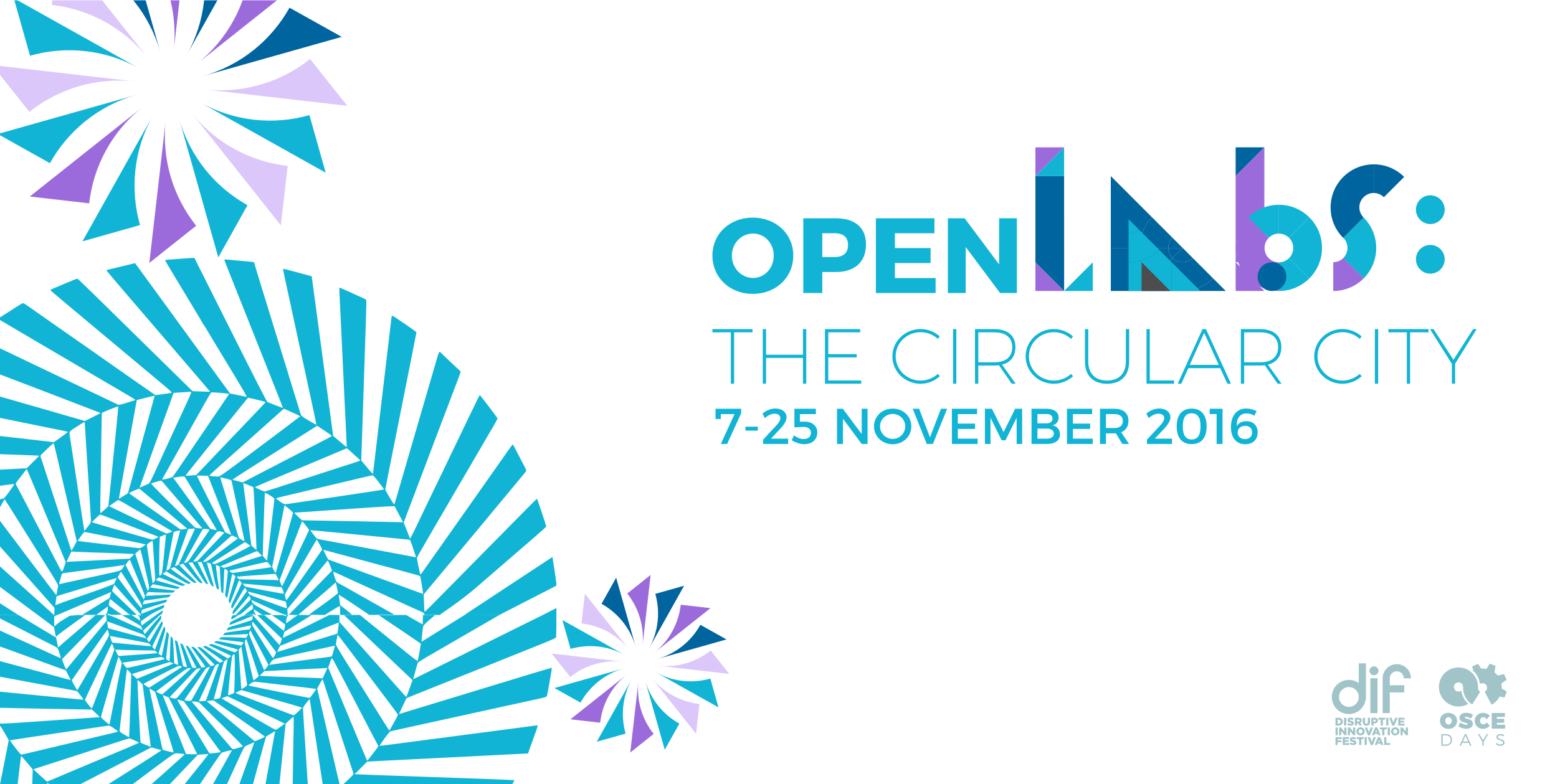
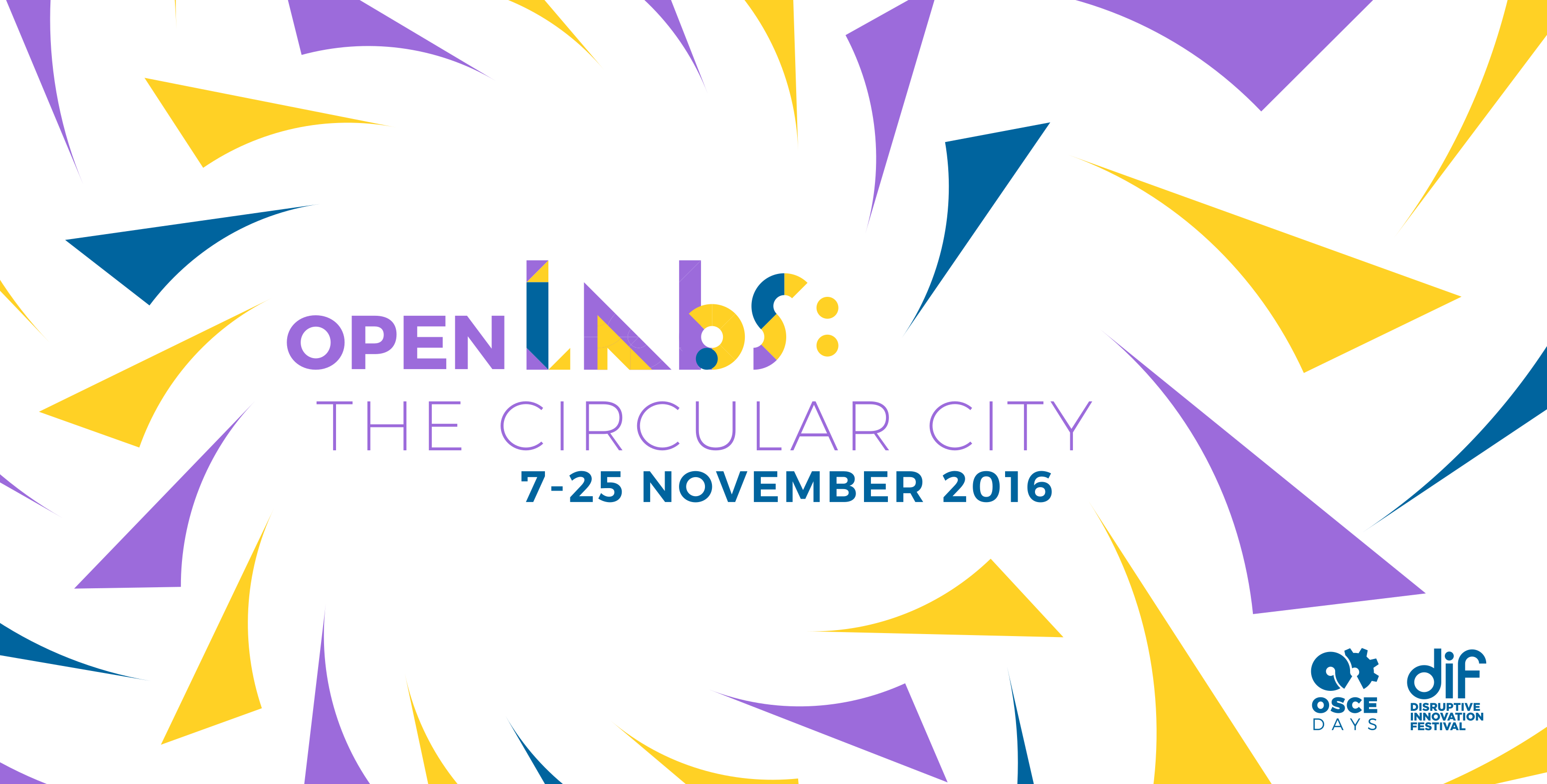
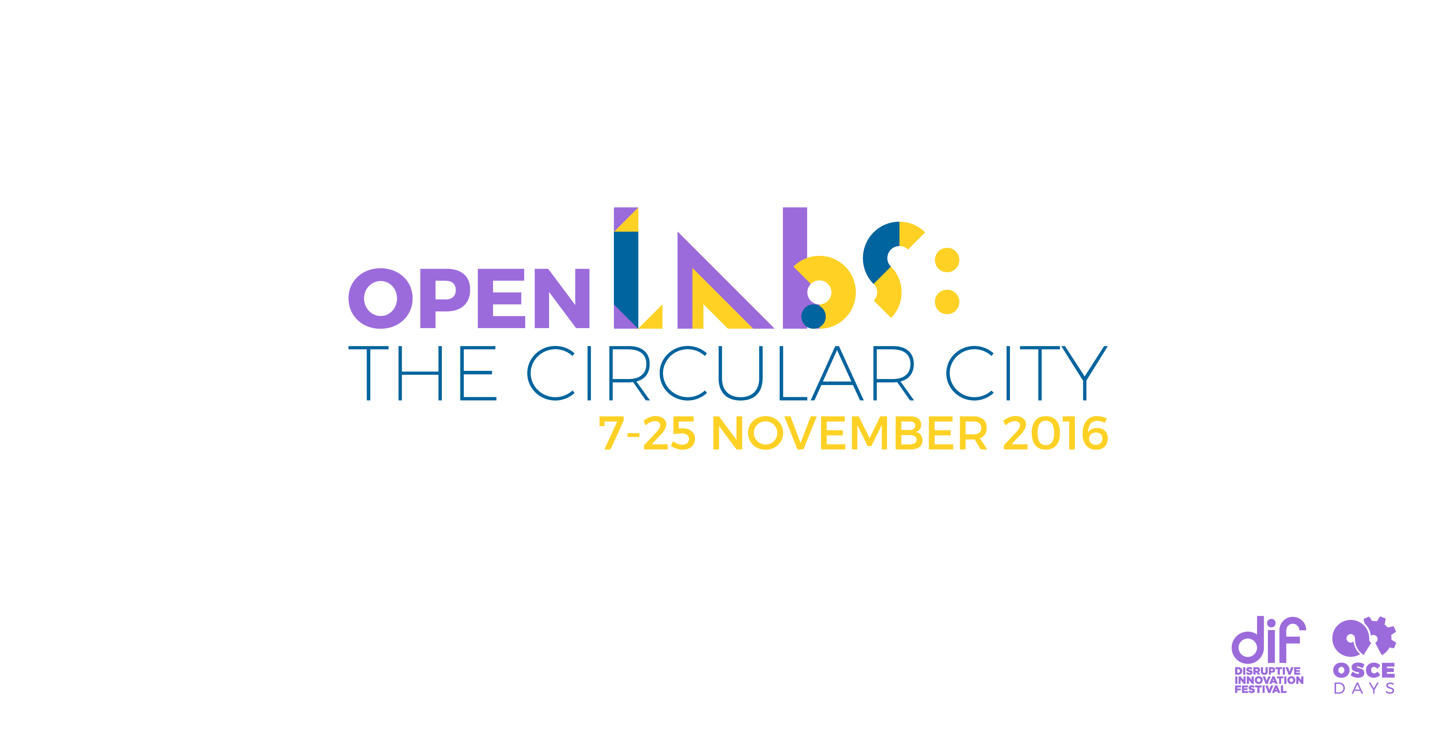
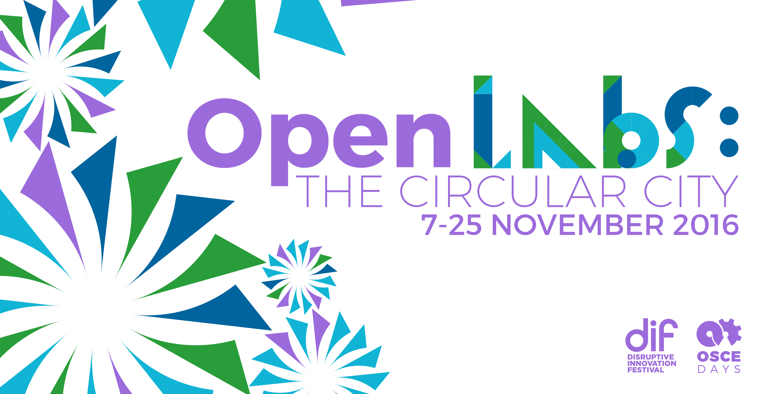
Posting quickly because I have to run and catch a train! @Lars2i and I met to discuss design for what we are tentatively calling OpenLabs: The Circular City.
Drafts are here, feel free to play with the SVG to try out different colours and layouts, or make suggestions.
The grey was just a ‘default’ not specifically chosen). The purple is the DIF purple.
or with different colours:
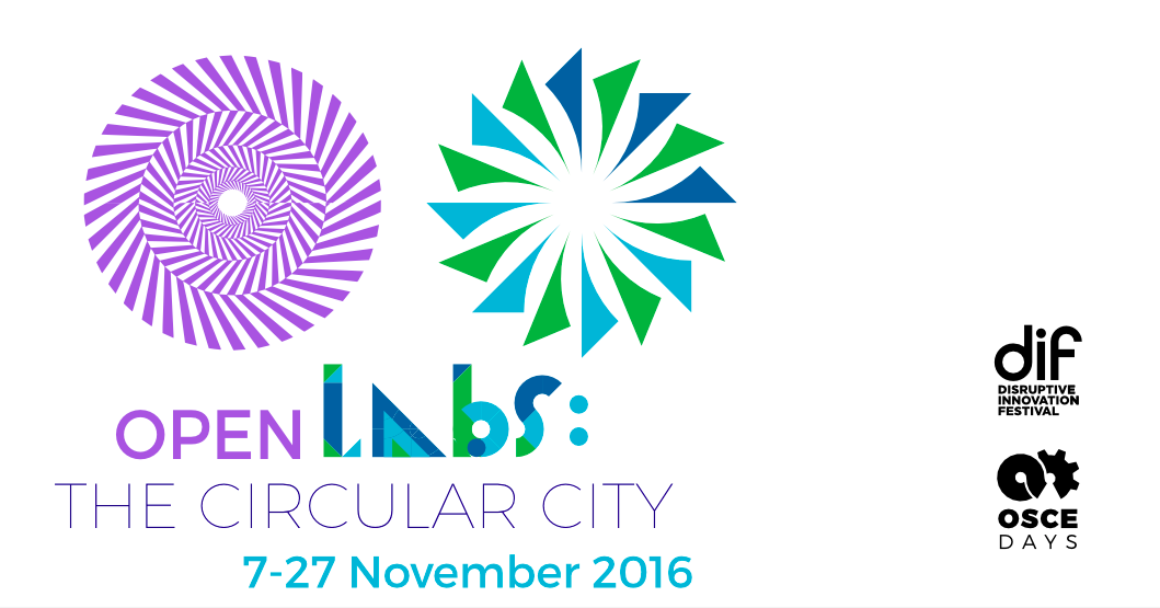
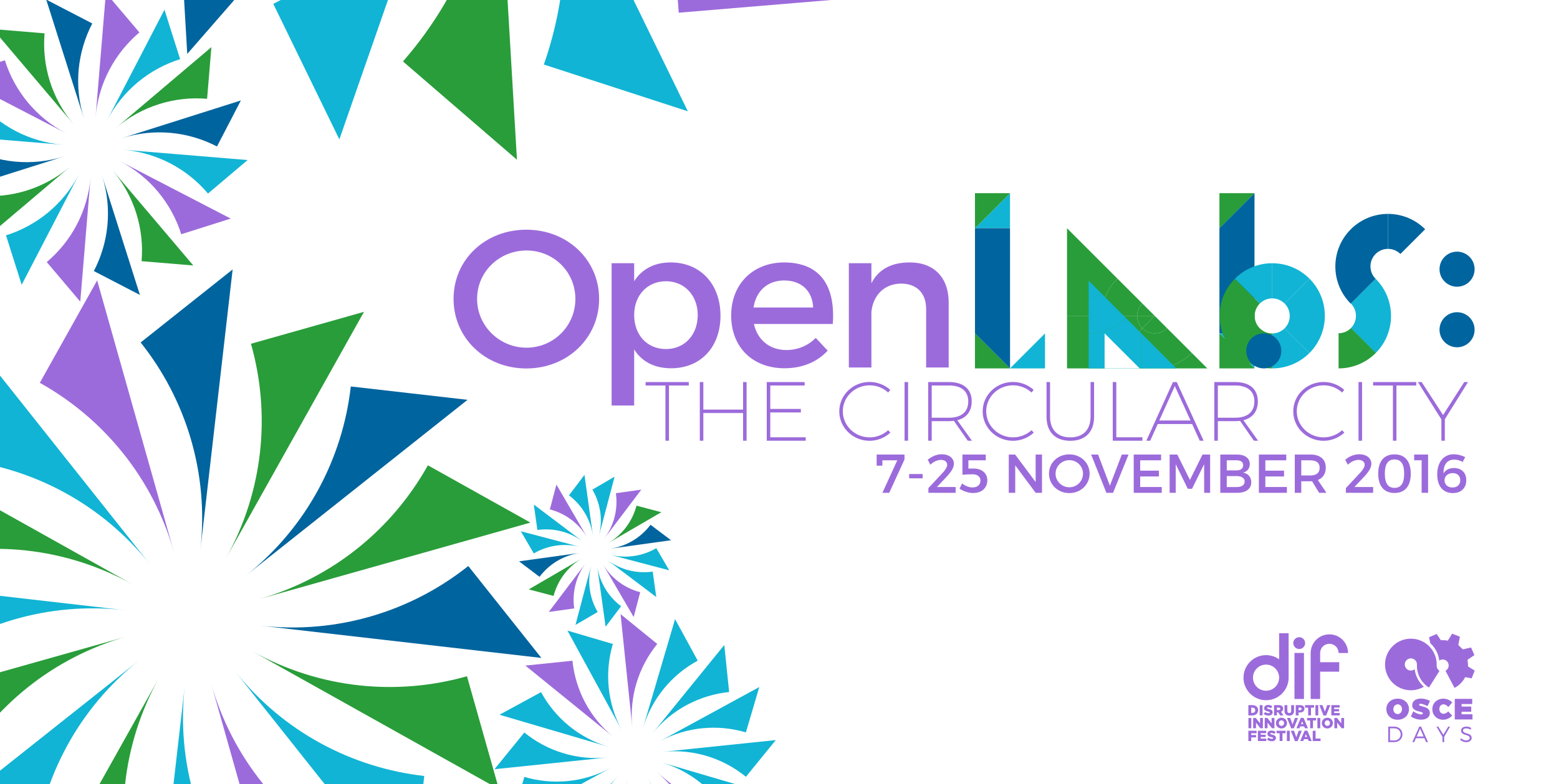
logo: 1st circle looks a bit psychedelic, 2nd one like a child’s windmill
I’m missing the circularity: one feeds into the other.
colourwise: second one has nicest colours, i’m not fond of the current trend of dark gray, but that’s personal taste
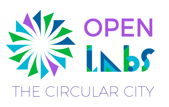
ah, yes, I should mention what the two symbols are: the one on the left is the DIF design, the one on the right one of the OSCEdays rosettes. I don’t disagree, just adding more info.
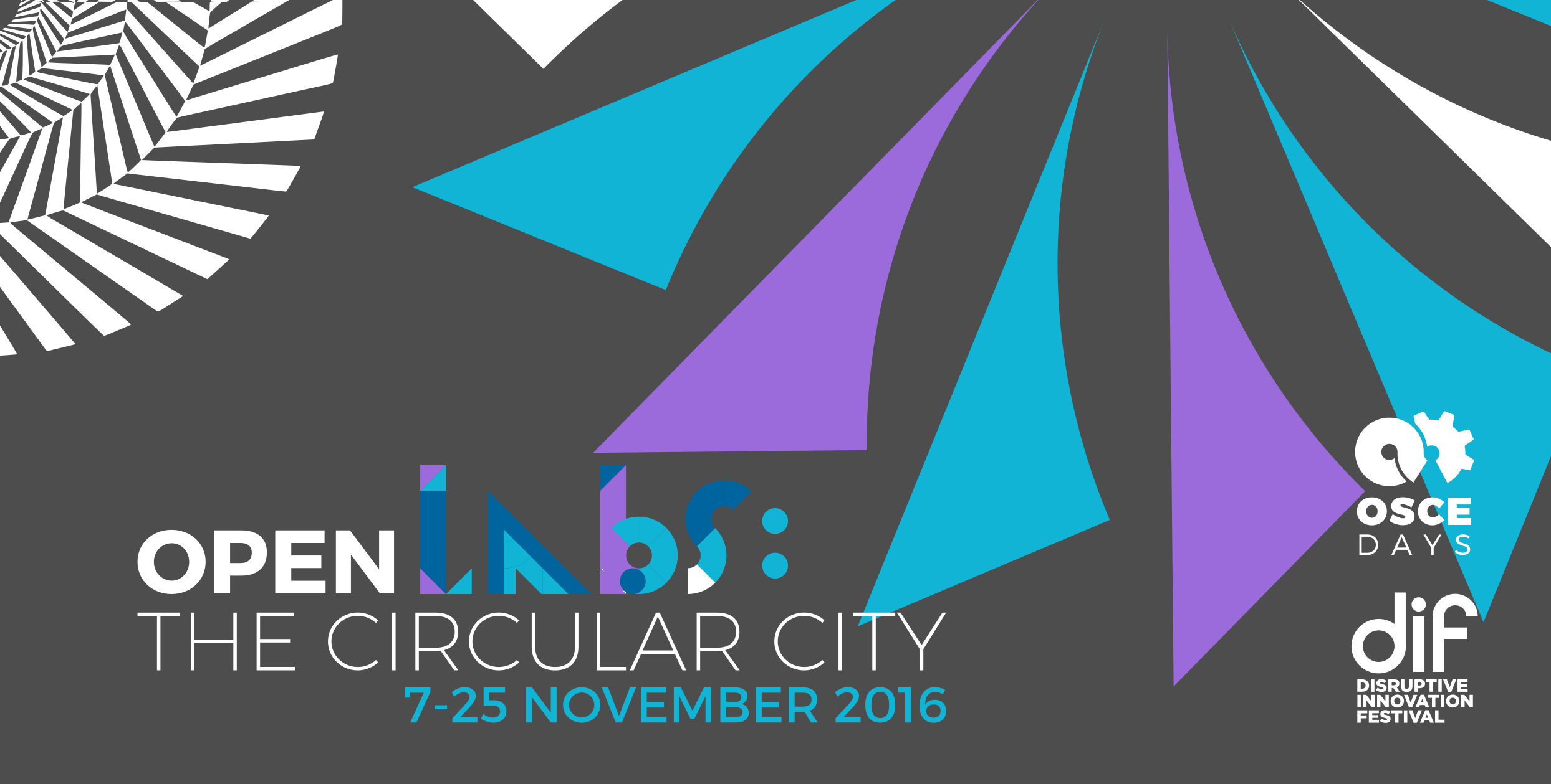
I played a bit with the colors and structure and here is where I landed.
I know what you will say: The DIF purple does not mix well with all OSCEdays colors. But I find the combination of the purple and the OSCEdays colors to have a certain edgy happiness that I find pretty appealing - and appropriate!
Ah, I switched places between OSCEdays and DIF Logo to show that DIF is in lead here.
More appealing than dark blue or dark grey. I think happiness and fun should be key. And maybe even edginess. That’s how we add value to DIF and make a difference, maybe.
I am out for tomorrow. Will be back on Monday and look at your iterations.
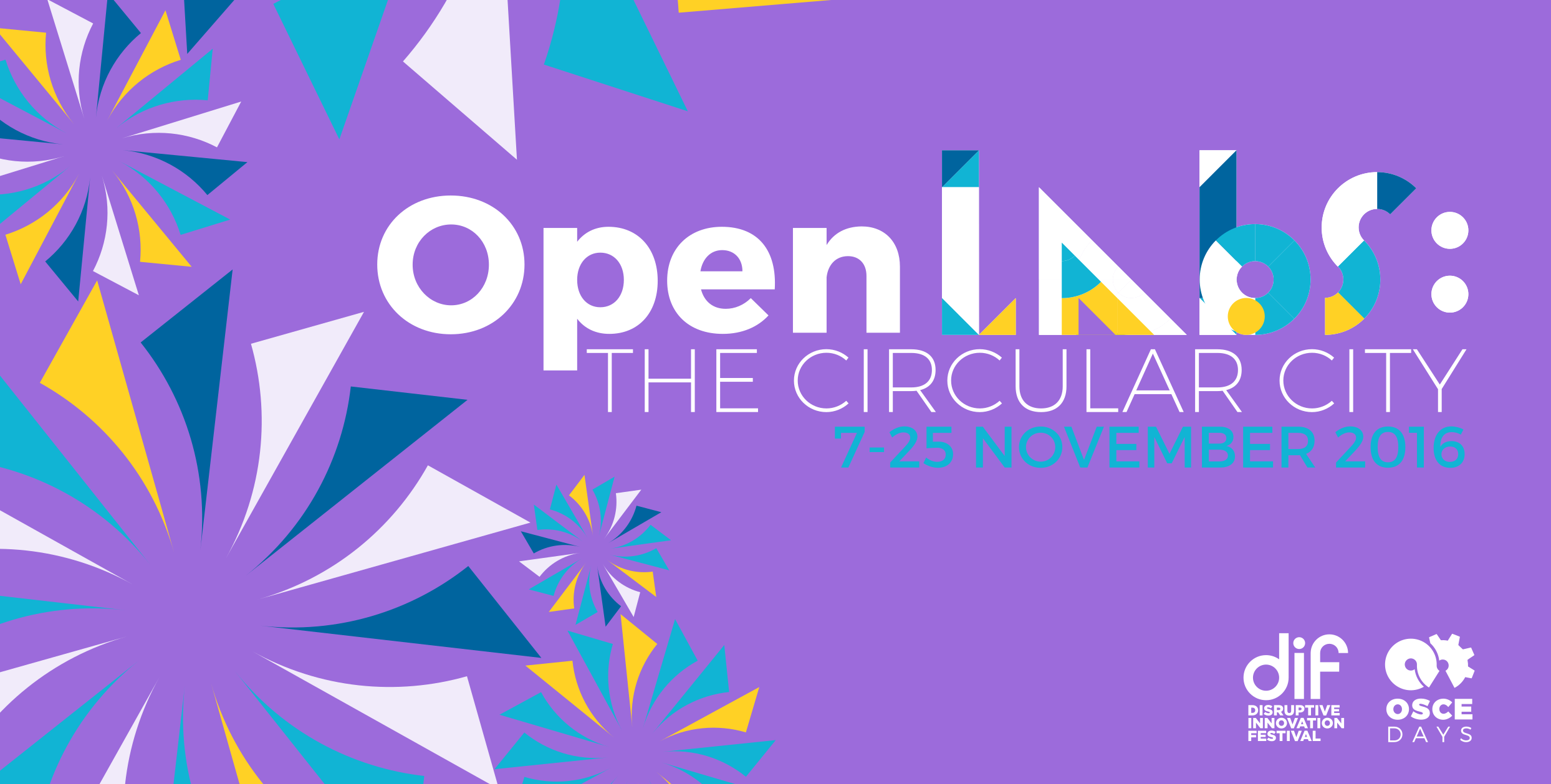
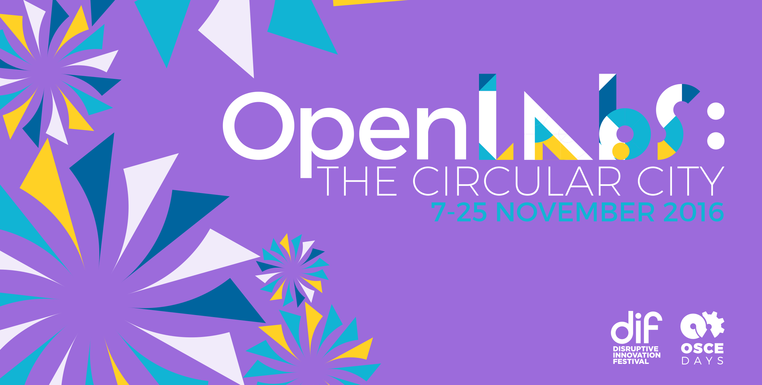
In that case the Logo should be fully visible. Do we have a more circular OSCEdays rosette? I haven’t been into the design too much so far.
Yes it does, I find it rather suitable to have them stand apart and be connected in such a way to illustrate the collaborative aspect of this event. The equal size of the circles puts us on par with them, is that correct? Maybe play a bit more with the proportions (logs/writing, distance to the black logos on the right…)
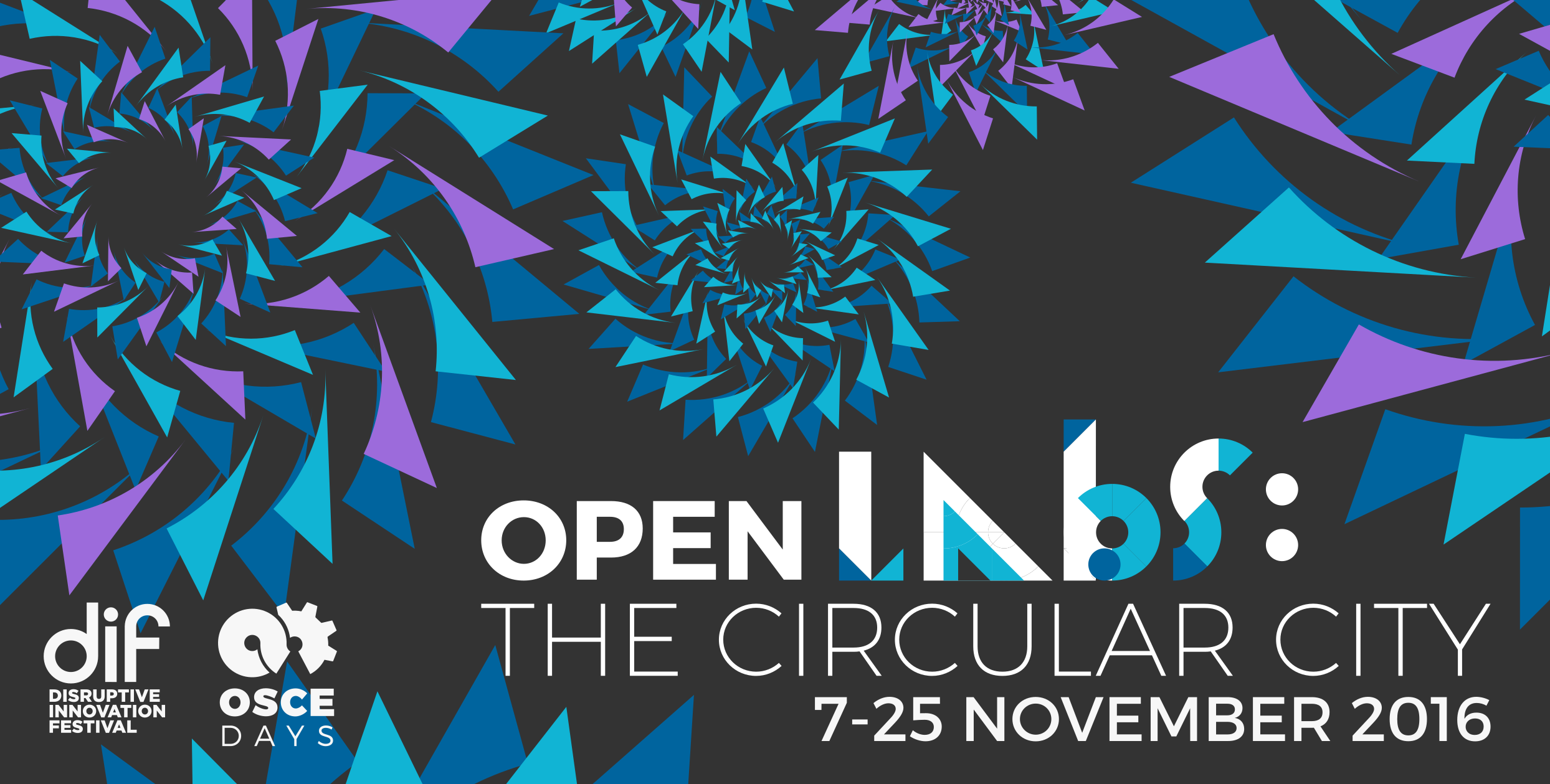
J & I tried out a few more options for the layout. Option A & D utilize the OSCEdays modular pieces but follow the cog-like design of the circular DIF element. In no particular order:
Mmh. I don’t know. I find all of those pretty confusing. And it triggers Halloween-associations; dark dark fairy tales, scary beetlejuice like atmosphere
Hey there, generally I quite like the playful designs so far, and I am sure we get to a good final design-decision rather quick…
I have a discussion point about the “Open Labs” naming: I quite like it all in all, but it introduces two new key elements to communicate (ext to OSCE and DIF): 1. Open labs; 2. The Circular City. It kind of introduces “Open Labs” as a new brand or series of Lab activities…is this on purpose?
I would prefer it if we could find a way where we focus attention to one element to communicate…
@cameralibre jeai, I think we are going somewhere.
@Frans – Good call. Let’s discuss this later in todays call in depth. But maybe yes – Open Lab – could be something, OSCEdays is doing from time to time. To put focus on a subject for example. And to engage in partnerships.
Open Labs: SUBCJECT – A collaboration between X & X & OSCEdays.
I prefer C. It is the most interesting of the three, and color-wise it doesn’t hurt. A is also okay. B is way too pink/purple to my taste. The bold “Open” works best.