We currently use Raleway all over the OSCEdays site. I find it good for headings, but it is pretty exhausting to read as body text - I think we should try pairing it with another font which is more readable in small sizes and dense blocks.
I made a PDF mockup of how the main page content might look if we tried a different approach. (I am crap at CSS and had limited time, so just made a document in LibreOffice - obviously there will be colour and other content on the website so this is just an indication of what the fonts look like rather than a full design mockup.)
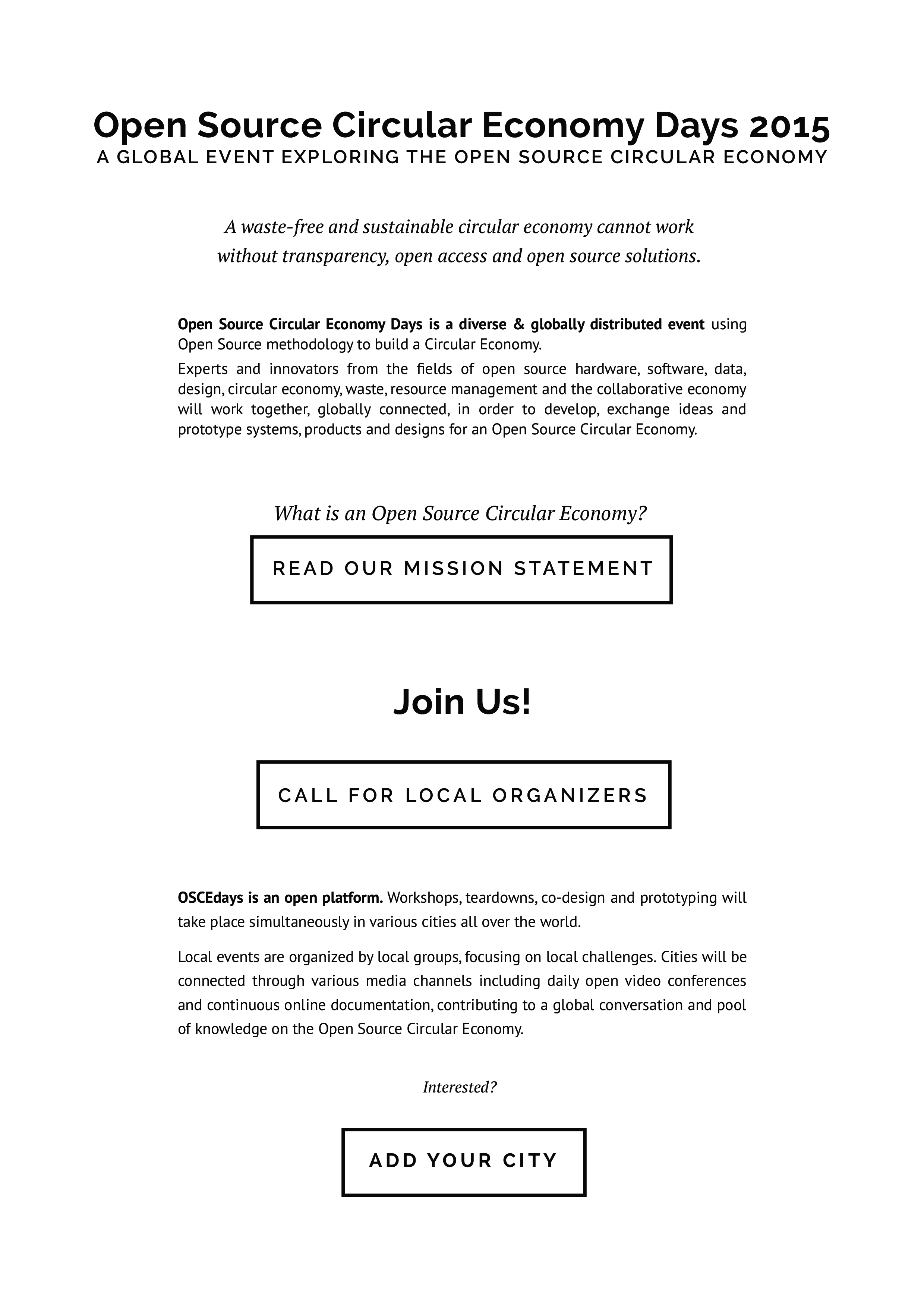
OSCEdays font test- PTSansPTSerif.pdf (66.0 KB)
This uses:
Raleway for main headings
(23pt, Mixed Case, Bold, 80% grey, Expanded by 0.5pt)
Raleway for ‘buttons’ or ‘actions’
(12.5pt, UPPERCASE, SemiBold, 80% grey, Expanded by 2pt)
PT Serif for quotes and emphasised text
(12pt, Sentence case, Italic, 80% grey, default spacing)
PT Sans for body text
(10pt, Sentence case, Regular, 80% grey, default spacing)
and some very basic ‘button’ outlines to show the calls to action.
Thoughts? preferences? other ideas?
The PNG won’t look as crisp as the PDF but you can view it right here in the forum, so here you go: