i was looking for some reasons today on the old OPENiT Festival webpage. And it made me a bit sad. Because i think, the design back there was so much better than the design we have for the OSCEdays now. The designi s good, but I never was really 100% happy with it.
And i had an idea. I think, it could be a big improvement, if we change the logo on top of the webpage and the forum a bit. Make the Writing black or 90% grey. I have the feeling, this is more precise, more distinctive and stronger, in the long run. What do you think?
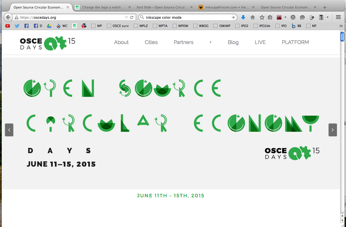
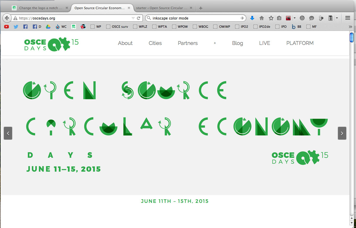
Hi changed it on the website for test reasons (with 90%). Check the second slider. It is not final. just for all of us to get a better impression. what do you think?
the os-programs i use change the colors of the design-files jenni created in proprietary programs a bit. so if we decide, that black is good, jenni or someone who has that programs would have to do the real changes
I don’t have strong feelings one way or another, but it does seem strange to change the design this close to the event.
If you’re using the oscedays green (2eaa4a) then any difference in colour you see is due to the colour space (sRGB, adobe RGB, pro photo RGB)which can be set in inkscape or any other graphics program.
However, colour is a horrible area to get involved in so I can do it or at least i’ll have a look later today and tell you which setting you need to choose.
If we go with the black/gray, I would suggest slightly lighter, maybe 80%. The lettering is already quite bold and readable, but i find it too contrasty against the white background.
Hmm, I would be inclined to stick with as is for now…perhaps you can change the version in the top left corner and would agree with Sam to go lighter or even the dark blue…
I’m not sure if it is the right time, fair to change it now (many of the local organisers have already incorporated elements, downloaded versions to use etc and will have sent out emails, blogs, news letters, based their website, FB with the current one). I would say that this is something that could be looked at for the next stages of OSCEdays, or during the days and can engage others more in it with more time and a complete, brand review?
Hmmm, I think you’re right about changing it @Lars2i but don’t think now is the right time…agree with both @cameralibre about the contrast and @TechnicalNature about the local organisers. I think if we do change it it should be done in a co-ordinated way…maybe at the same time rethinking the name too, like we briefly chatted about before.
would be nice, while you are on it anyway, if you not just tell me the settings but also create 2 or 3 version and upload them here. One with 90% grey, one with 85% and one with the dark blue.
You just need to change the colour profile (File> DocumentProperties> Color> Available Color Profiles> Compatible with Adobe RGB).
Inkscape can open EPS directly without needing to convert it first, the conversion to standard SVG may have been the cause of some colour problems - but all the different logo forms are available as SVG in the Design Files folder anyway, so you don’t need to worry about converting from EPS.
(OSCEdays Design Files> OSCEdays Logos & Branding> SVG)
I’ve put blue and 80% black versions in already, feel free to add others.