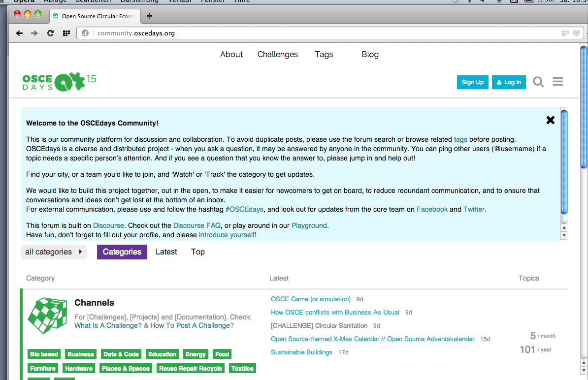
With the OSCEdays 2016 potentially a lot of new people will visit the forum. When you visit the forum the first time you see the big welcome message Sam wrote last year. The message is great but covers half of the screen.
front
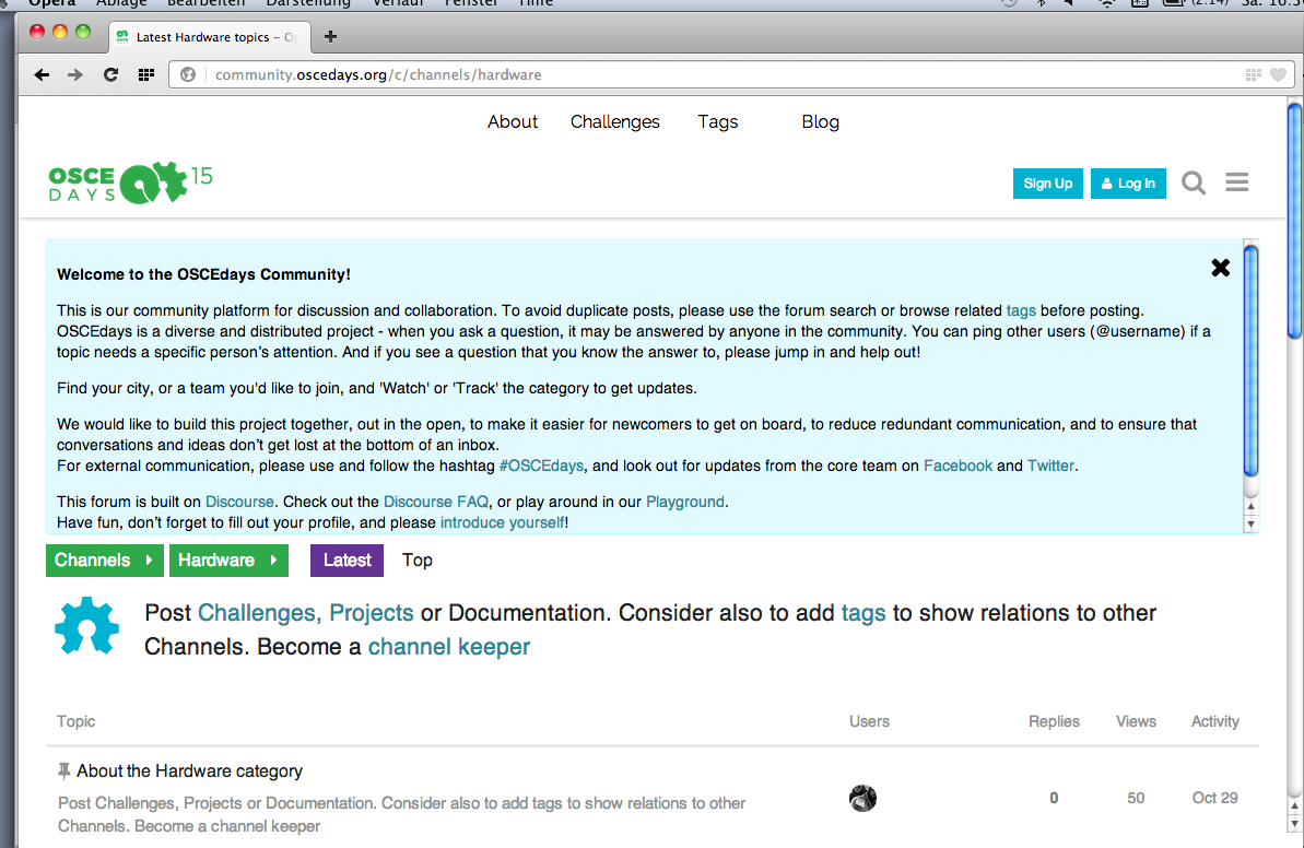
category page
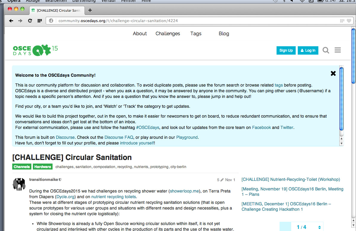
single challenge
###This comes with a lot of problems:
(1) It makes the forum look even more techie and hard to understand as it already is. It adds a color and structure to the page. Too much information.
(2) Most people that click on the forum for the first time are not looking for this information but something else – a READ ME, a challenge or whatever. They have to scroll to get to this information. And they have to realize that they have to scroll. And that the information in the blue box is not the information they clicked for.
(3) And I have seen people working with this message on top for a while, never found out, that they simply can click it away.
###My suggestion
So my suggestion would be, to replace this message with a shorter one:
"Hi, this is the forum of the OSCEdays. Sign up and get started. Wanna have first introduction to how things work here? Please click here. [LINK]"
And the LINK goes to the longer and maybe modified welcome message.
Just one line… What do you think?