[BOST MEETING, Nov. 23, 2015] Provisional Board Meeting 1

Call, November 23, 2015, 8pm GMT

Find a complete list of future and past meetings here.

###AGENDA

##(1) Introducing ourselfes
Hi, we have new people in the call. Please introduce yourself. And how are you.

Parte of the call were: @Jaime @Gien @cameralibre @unteem @sharmarval @Lars2i

##(2) General questions?
Anything important to ask, before we continue?

##(3) Building of the OSCEdays organisation

###3.1 Statues in progress
About to finish the statutes and send it to the finance-authorities to check non-profit status (will happen this week)
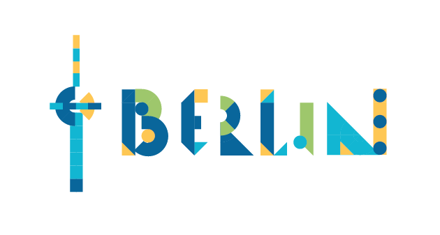
###3.2 Berlin group
Introduced the OSCEdays Berlin group to the organisation and the process, we sketched so far. They agreed.

###3.3 Search for a "Vorstand"
We need to find a „Vorstand“ - someone that wants to do the (payed) job. @Lars2i created a job-description. Lets check it together.

##(4) The New Event for June 2016

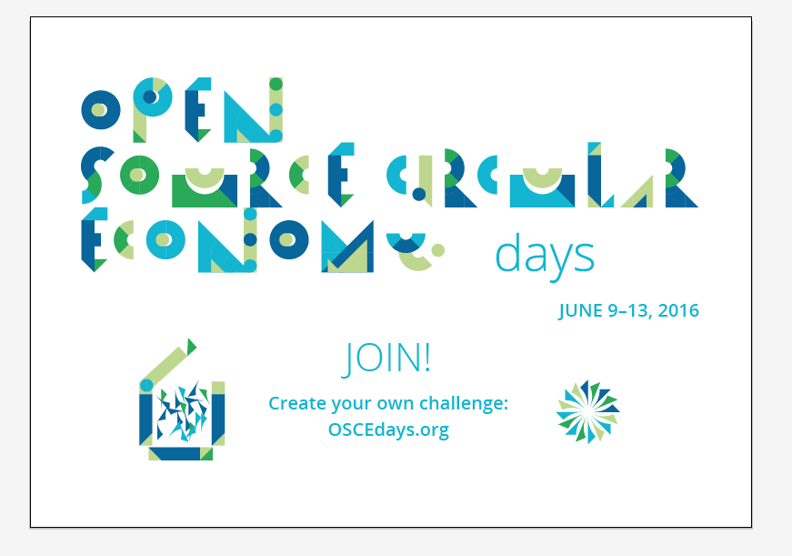
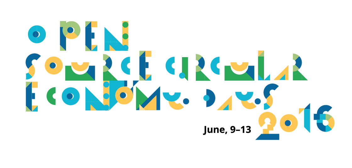
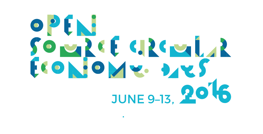
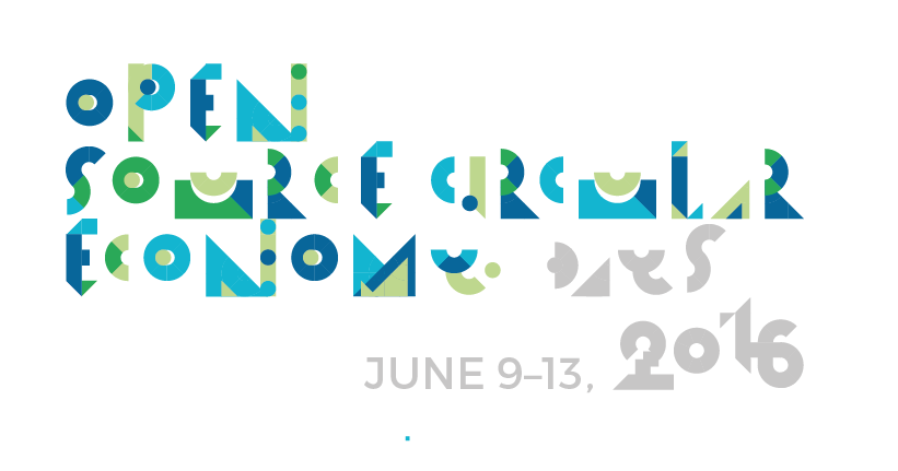
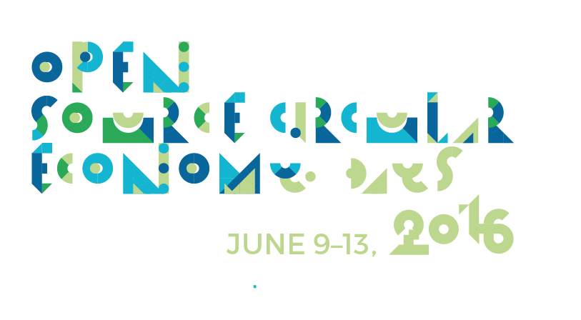
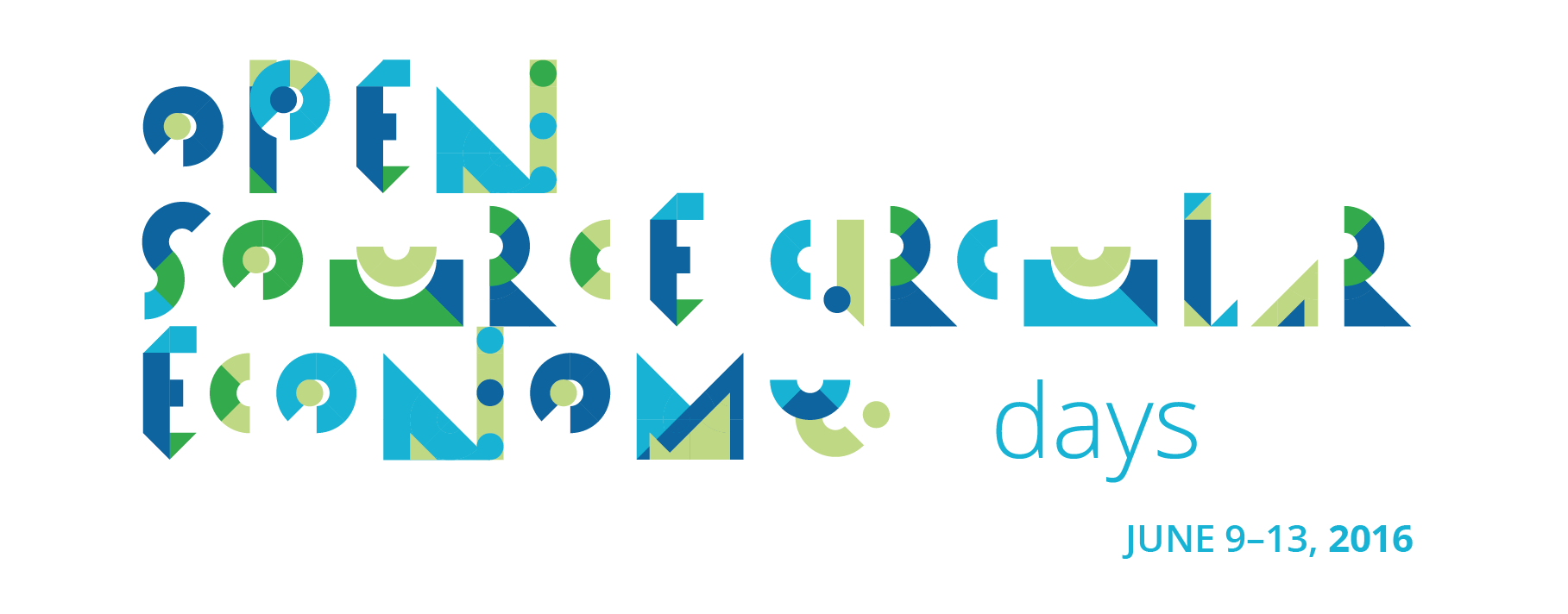
###4.1 New design is finished
Here is the new design. What do you think?

###4.2 Webpage
The webpage is in preperation. Lars is going to build a new Page based on Wordpress. Tim is experimenting with other technologies. When he is done he will let us know. For now we stick with wordpress. When the new page is up (will be tested in a Sandbox first), someone has time to give feedbacks?

###4.3 Call for Cities 2016
Put the Call for Cities out? Any ideas for outreach for next year? When do we start the call. How will we spread it? We need some kind of marketing strategy.

###[4.4 Funding]
: Funding details are not discussed publicly to protect the interest of eventual sponsors or partners; but everything that can be shared will be shard publicly as soon as possible.

##(5) Schedule
I think we should prepare a schedule for this provisional board meetings, to get more people into the process. Find our atmosphere. How about Monday every two weeks from now on, same time 8pm GMT?

##(6) To add
Anything missing?

@Jaime @Gien @cameralibre @unteem @sharmarval @TechnicalNature @Lars2i

1 Like

The link to the new design seems to be missing

jepp, was not finished with posting. You are too quick :slight_smile:

timssandbox.owiowi.net

http://thecityisopensource.de

##PROTOCOL

The call followed pretty much the steps in the Agenda above and took 90minutes. Here are some outcomes that are not just restating the Agenda.

###3.3 Vorstand

Job description and call was approved.

###4.1 Design

Feedback on @OTTILIE design :

It is great. Some small improvements to make:

  • No Open Source Logo “O”
  • “Days” and “2016” also in the created font - like shown in one of the drafts above - but just in one color - maybe grey or just blue
  • The Date in another Font - can we use Montserrat - the same font that the OSCEdays logo uses.

###4.3 Call for Cities

We decided to start the call for cities in January. New year, new luck! We will use all our channels, a thunderclap, send a newsletter and ask our networks to spread the call. The January date gives us time with the webpage.

###4.4 Funding

How is the difference between a local organizer and the global event/organization?

Funding wise local organizers and the global organisation operate entirely independent! Local organizers have to communicate, that they speak for their local event. The global event speaks just about the global side not about local events. It might happen, that the same local organizers and even the global event approaches the same sponsor, which can be considered bad style. We did not find an idea how to solve it. But if the difference between the local events and the global side is communicated clearly it should be ok.

What is the value proposition of the global event to potential sponsors?

Well visibility of course - promotion. But we can also help them to create their challenge, to frame a challenge in a way, that might appeal to the community. Of course we can’t and will not promise that anyone will take on the challenge obviously. But we will help to frame the challenge in a way, that it is really open source and useful for the community and the sponsor at the same time. So that real synergies can be found. And of course the sponsor can advertise his challenge on the OSCEdays main page.

###(5) Schedule
We decided that this provisional board meetings will happen from now on regulary every 1st and 3rd monday of the month 8pm GMT. If there are people joining from different time zones, that can’t make it at that time, we will restructure of course. And the onboarding process continues.

Over the course of time we can form different working groups on different subjects (like design, documentation, funding etc.) that can have their own schedule and will be open as well.

###(6) to add: neo4j
@gien and @unteem are very interested in the technology neo4j and to make it work for the OSCEdays platform and community. They will try to set up a hackathon between different cities to get it run. Anyone interested in helping them with that, get in touch with them.

ok, i hope i covered all the important things. Did i forget anything @Jaime @gien @cameralibre @sharmarval @unteem

1 Like

hey all, @Jaime @sharmarval @Gien @cameralibre @unteem @TechnicalNature

Here is the new version by @OTTILIE for the design following our suggestions, what do you think?

2 Likes

Yep, like it better and I have a preference for the last one (don’t you think its annoying to be forced to write at least 20 characters, often I have to write longer sentences so my message can be sent)

1 Like

Amazing @OTTILIE !

I vote for 1 or 3.

@unteem Yes it is annoying, but it also does prevent monosyllabic answers!

Hi everyone,

To be honest (and everyone knows what comes after those words unfortunately), I find the font a bit too busy for my taste

. It is definitely a unique font but difficult to read.

I’m afraid that it will add a delay time for people to figure out what it says. Why don’t you take a survey with people? Make a simpler logo and see which ones they would choose. The Y is especially problematic. You could turn the bottom part of the Y to face the left instead of the right and that would help its legibility. That being said, still too busy.

I just did a quick sketch of another possible idea with circles and attached. WARNING: I’m not a graphic designer. This is just a crude sketch to give ideas in other directions. Definitely not presentable. But it shows other ways to incorporate circles without being so busy. @OTTILIE would have to add her magic to it to stylize it.

Mmh, the “hard-to-read-the-first-time”-problem was there last year too. But it worked well. When people see this design (webpage and fb) there will always be very close in normal font “Open Source Cirular Economy Day” - so they compare and have their Aha-Effect in a blink. And then they already have a connection to the image, because they solved the riddle - in theory.

It is not a problem, that it is too cryptic for first time readers.

And the font is modular - which will be revealed in the illustration that will follow and accompany everything. It it is made for people to hack and build upon. Last year we had some people creating their own City-Logos following the design part. This design is made for this.

here are some first hinds:

So the design has this easy to access “in-group” thingy - where circular and open source principles come together.

I think it works.

The Logo will stay the same anyway, every year.

1 Like

If I had to choose, I would also go for 1 and 3.

And I also agree a bit with Gien. I think the message is understandable by people who have already been exposed to the concepts of Open Source and CIrcular Economy, but people who are outsider will have a harder time to decipher both the typography and the “Open Source Circular Economy” idea.

I would always go for clarity over cleverness.

If we can have a simpler proposition I think it would really add a lot.

That said, I love the modular touch.

1 Like

I find the design hard to read, a bit too modular, especially for people who don’t know the terms yet.

Jeap. I will sit down with Jenni and try to find an idea for a better version.

We said, if we can’t find something, that really promises a huge step, we should stick with this one.

Do you have an idea? Or anyone else? Please share. We will meet this weekend (december 12).

I think the Y - U - A are really hard to read. Maybe I would take off the green in N and M too (the greens that fills the holes). This way it will make it more clear and perfect.

1 Like

Yip, I also agree with @Jaime and @Gien that simplicity is better. I’m sure this simplicity can be achieved with the font we have.

To add to @unteem maybe also the spaces between the words can be increased to make it more legible?

Thanks @OTTILIE for your wonderful work (and patience).