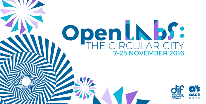
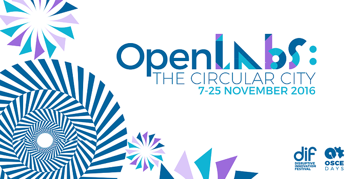
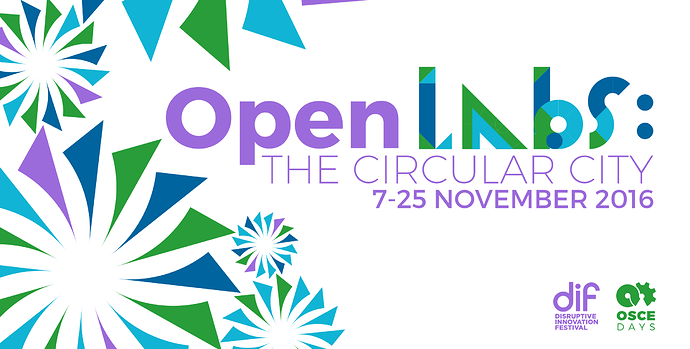
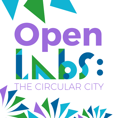
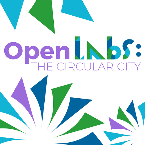
OK, thanks for the feedback, I’ll create new versions and have them online in a couple of hours!
thx. Ah, and check if the ‘OPEN’ really needs to be bold. I found it to working in normal font as well and beeing a bit clearer.
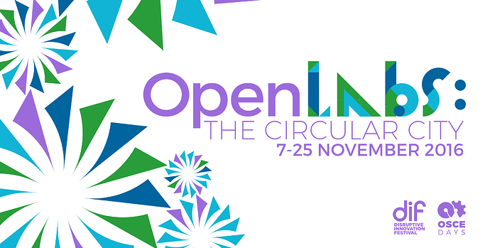
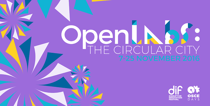
OK, I tried it with OPEN as Open, and I think I prefer it. I’ve included both bold and normal Opens.
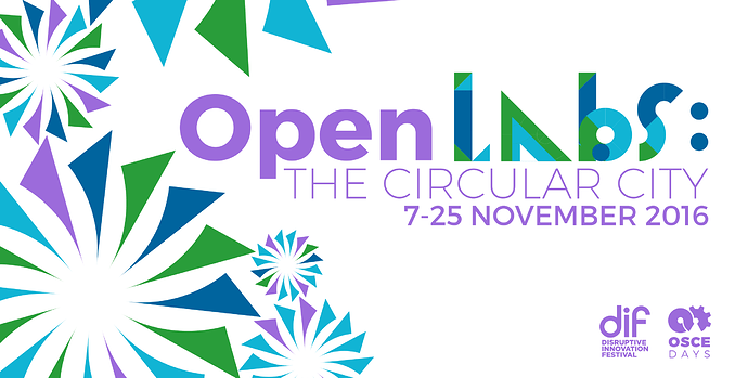
1017_A:(Lars’ color scheme)
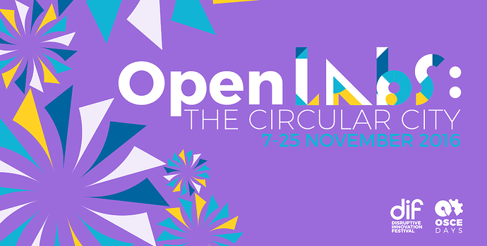
1017_B:
1017_C: (1016_C, revised, with more dark blue)
Hey there, generally I quite like the playful designs so far, and I am sure we get to a good final design-decision rather quick…
I have a discussion point about the “Open Labs” naming: I quite like it all in all, but it introduces two new key elements to communicate (ext to OSCE and DIF): 1. Open labs; 2. The Circular City. It kind of introduces “Open Labs” as a new brand or series of Lab activities…is this on purpose?
I would prefer it if we could find a way where we focus attention to one element to communicate…
Looks great, good work. I think my personal preference would be A > C > B of this latest iteration. Agree with Maike that B was best of original set.
@cameralibre jeai, I think we are going somewhere.
@Frans – Good call. Let’s discuss this later in todays call in depth. But maybe yes – Open Lab – could be something, OSCEdays is doing from time to time. To put focus on a subject for example. And to engage in partnerships.
Open Labs: SUBCJECT – A collaboration between X & X & OSCEdays.
I’ll add it to the Agenda.
I loved the “Halloween” versions, but from the new designs 1017_A is the best imo
I also liked the “Halloween” ones…but of the recent ones I like them in bold in this order: A > B > C
I’d say: not too many circles
I prefer C. It is the most interesting of the three, and color-wise it doesn’t hurt. A is also okay. B is way too pink/purple to my taste. The bold “Open” works best.
A over B over C…changed the symbol. Thanks.
Ok. Vote count (including the ones from the Skype chat)
A: 1 1 1 1 (1)
B: (1)
C: 1 (1)
E: 1
Normal Open: 1
Bold Open: 1
You can wait a bit more. We communicate the current design back to DIF now to see if they ask for changes regarding the name/branding.
Ok. we got a green light from the DIF about the branding and design.
@cameralibre you can wrap it up then. Still a small Logo is missing - the ones above from me are a good start.
And I wonder, if in that design now (A) the OSCEdays Logo could be green.
Personally I prefer it with them both purple, it seems a little off-balance with the logo in green:
Does the small logo have to be perfectly square, or just square-ish?
here it is perfectly square:
A:
B:
C:
Great. I think you are right. Both in purple is better.
Nope. The small one does not have to be a perfect square – although it would be cool, if you provide a file that is – just add a bit of white space on the right edge - this makes it easier to use it on the forum (resizing)
The small ones you added are good! Only problem is, when it gets really small - ‘CIRCULAR CITY’ is not readable anymore. Any idea how to solve/improve that?
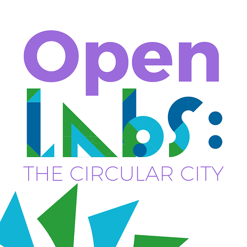
Not saying this is better – but maybe you can test something like this?
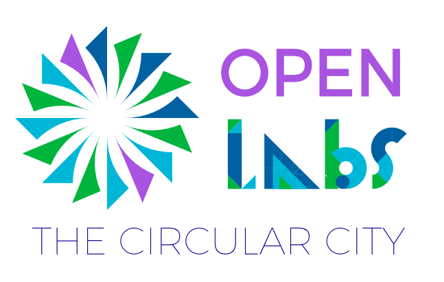
Update: Ah, just returned to this page. I think it is good enough. So, job done. Thanks Sam. Good job.
Hi Sam, can you provide the Slider and the Squares (all or A & C) with white background and also with transparent background & upload here and in the design folder. thx.
Are you cool, if they are shared under CC-BY (Attribution To @cameralibre) or do you prefer CC-BY-SA?
I generally switched to CC-BY with most of my stuff and I think in the case of this collaboration it might make sense for OSCEdays too.
Ah, last comment: Could you share the color code of the DIF purple?
